Helsinki ice cream factory
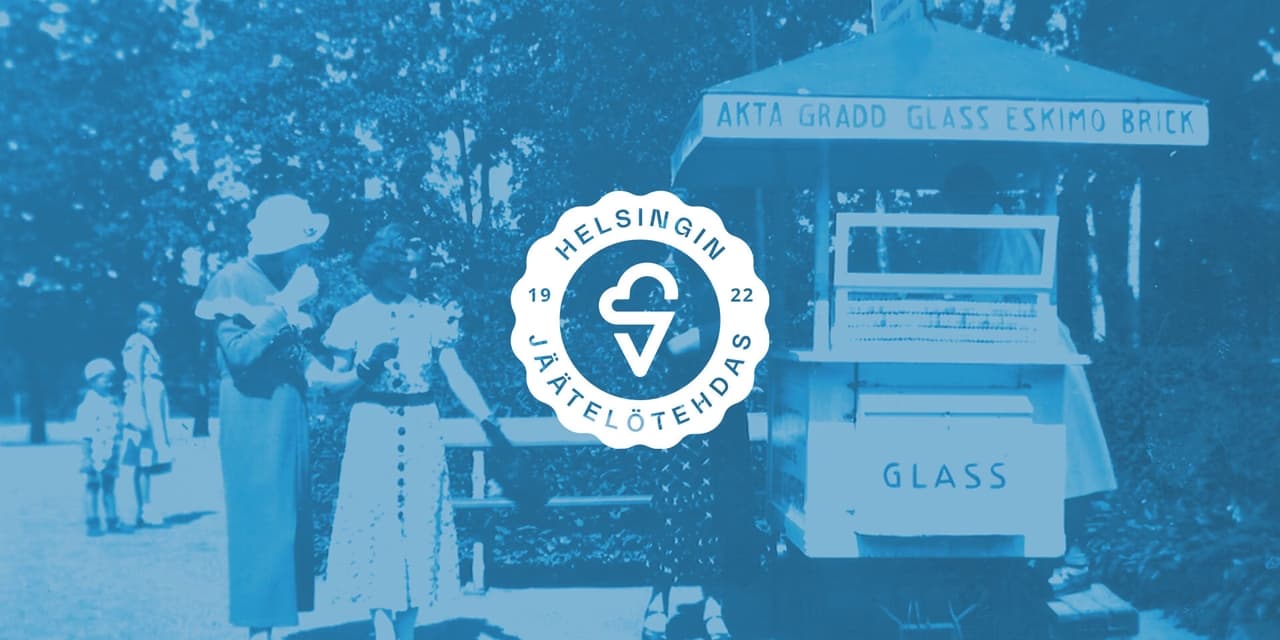
Helsinki Ice Cream Factory, which celebrated its 100th anniversary, passed to its fourth generation of entrepreneurs in 2021. At the same time, the business was given a fresh boost: the brand was revamped and the company set its sights on retail stores. G-Works had the honor of stepping in to help.

How do you do it?
Just four months until Easter and the opening of the ice cream stands, and an entire brand in need of a makeover. The project began with a very clear timeline and milestones, which allowed us to move purposefully toward the final result while still leaving room for creativity.
Fortunately, the ice cream company had a very large fan base, which we decided to leverage in the design process.
Set up a workshop and make your brand stand out
The brand renewal began with a workshop where we took a step back to reflect on the company, its brand, and its customers. Who are we doing this for, what are we doing, and why are we doing it?
Based on the workshop, the brand underwent a rather bold repositioning: it was decided to move the previously used, century-old Magi brand to the background and focus all communication entirely on the Helsingin Jäätelötehdas brand. Support for this decision was further sought through a Facebook poll.
Emotional state and concepts
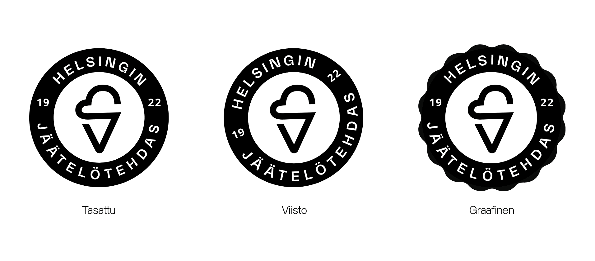
After the workshop, we began exploring the visual design using several different concepts. The goal was to combine 20th-century Helsinki romanticism, modern color schemes, and the playful spirit of ice cream.
Illustration
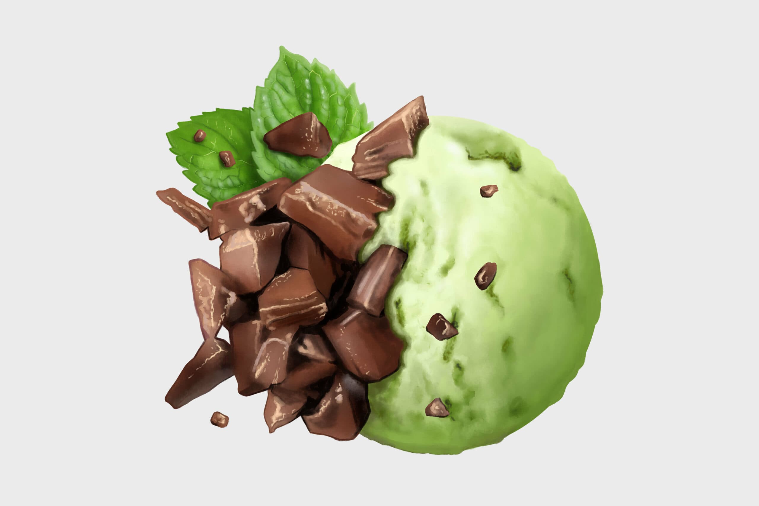
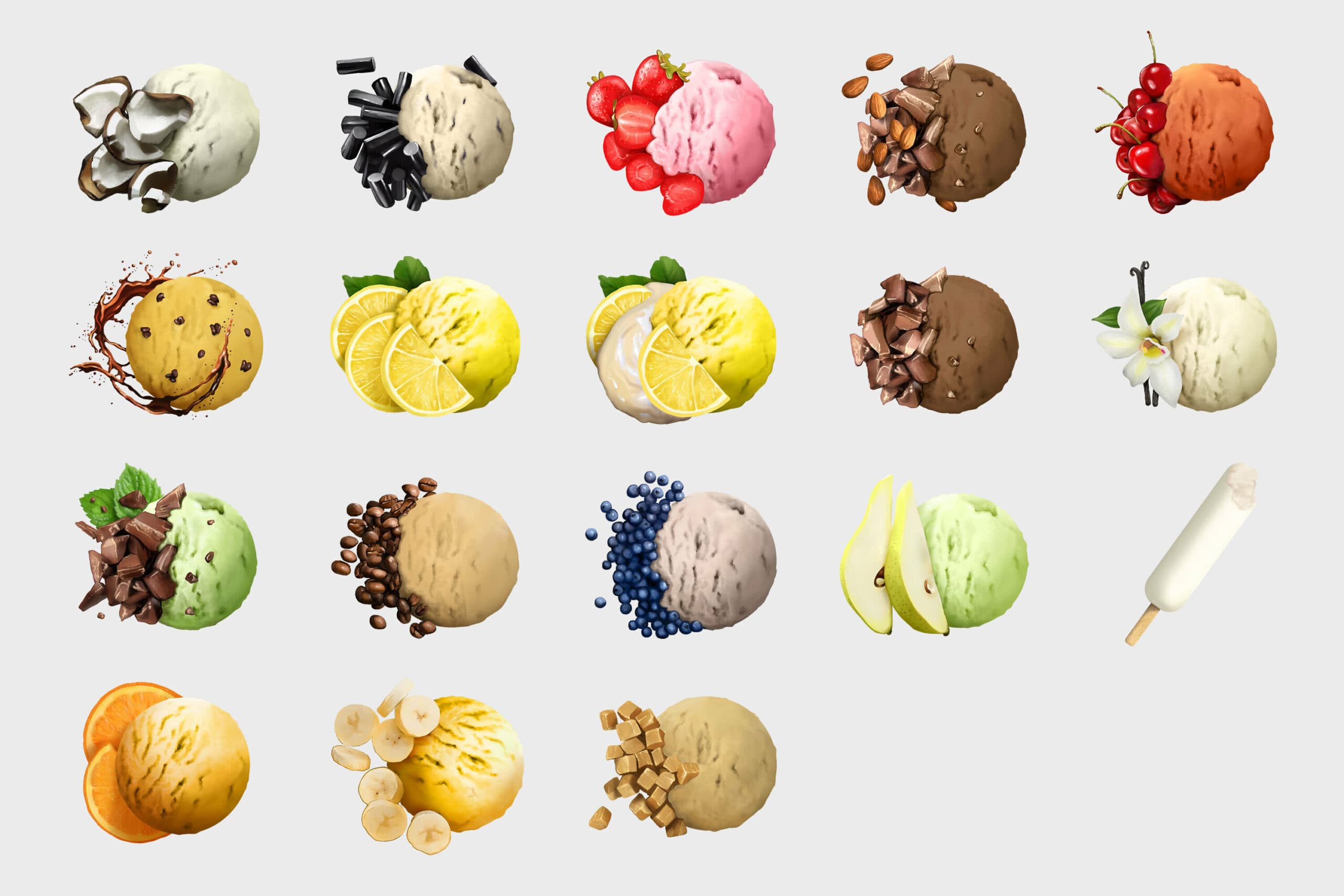
At the start of the project, we envisioned creating product descriptions for ice cream scoops, but we quickly changed our minds. An illustrated scoop fits the concept better. By combining the main ingredient with the ice cream scoop, we achieved a result that looks quite delicious.
We created these entirely in-house, and we’re pretty proud of them.
Taping
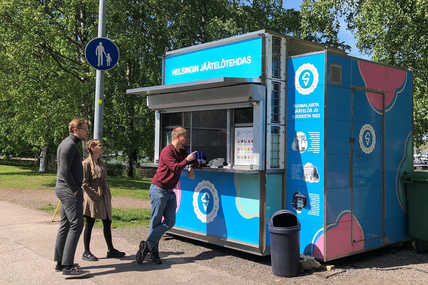
The goal was to make the ice cream factory’s kiosks stand out clearly from the streetscape and be easily recognizable. Ice cream is fun and playful, and the kiosks can be cheerful, too.
As a clever touch, they also came up with a way to improve the service concept: the ice cream menus should be placed on A-stands a little further away from the kiosk. That way, customers can safely choose their favorites from a bit of a distance, rather than having to rush up to the counter.
Website
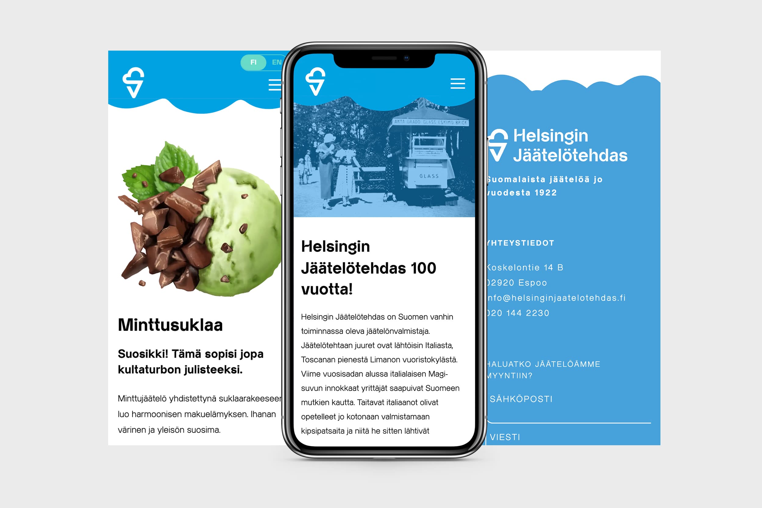
Every organization makes its first impression through its website, and the Jäätelötehdas project also included a website redesign. The new site is customizable using WordPress and is built on a lightning-fast headless architecture.
The illustrations are entirely the work of G-Works, and some of the site’s text was also penned by G-Works. The praise for the ice cream is genuine—it comes from the memories and experiences of the factory’s Facebook followers regarding their favorite ice cream flavors.

In conclusion
The project had a tight deadline: the kiosks were set to appear on the streets after Easter, and you can’t negotiate with the seasons. The deadline brought clarity to the process and kept all parties moving at a steady pace. Both the project and all its intermediate stages were completed precisely on time and as agreed.